How to Design an App
What I have experienced designing Apps
Everything starts with a design, right? Maybe. Maybe not. It depends.
The underlying design and the user interface works together to
form a design experience. Read here how I did design for some Apps.
What applications I used and what problems I had to solve.
![[cml_media_alt id='1574']design-iphone6-1280x720.001[/cml_media_alt]](https://www.flagsoft.com/cmswp/wp-content/uploads/2015/02/design-iphone6-1280x720.001.jpg)
What to display?
Well, this is a good question. If you have text on your design make sure it is readable also for very small sizes.
I use a tool to display all icons in all different sizes just to make sure that the design is readable.
Tips
Size and form
The size I use is 1024 by 1024 pixels. I save it as PNG without transparency (alpha channel). No rounded corners needed. The device itself will round the corners.
App Icon
This is the icon you will see on the screen. The first impression of your app.
Launch Image
This is the image that will be displayed after you start the app. But more and more this image is getting not so important. For example Facebook and other apps don't use a launch image or the launch image is the same as a background of the app. This does in fact suggests that the app is already loaded - but it's not.
TIP: Which Software should I use?
Well, this is totally up to you. I just use InkScape and GIMP very often. They work well. But also any other software or application will do it as well.
Keynote maybe works also for launch images. But as far as I know Keynote limits you to store images less then X x Y pixels.
TIP: How to remove transparency, alpha channel?
If you work with a Mac you can do it just with Preview as shown in the video tutorial.
Choose File > Export. Then select PNG from the list. Unselect [ ] Alpha. Finally hit Save. Done!
If you are using GIMP you can load the PNG there, then right-click on the layer, then choose remove alpha or similar menu entry and you are done.
If you are using PhotoShop you probably already know it.
App Icon
The App Icon is in fact very important. It's the very first thing a user get in touch with.
![]()
![]()
![]()
![]()
![]()
![]()
![]()
![]()
![]()
![]()
Every App Icon starts with a 1024 by 1024 pixels square image. You can basically use any program to draw an icon. I used InkScape and an automated mobile and tablet icon generator to resize the icons. You don't need the rounded corners here because iOS will do this for you. So if you ask a designer to do your app icon, just ask for a 1024 x 1024 pixel sized square icon without rounded corners and without transparency. This means, there needs to be no alpha channel.
Launch Image
Users love good looking and clear designs. But a design does requires a solid rock beneath it. So my question was about what can I display with a design and how I need to do it. This sounds simple, but it is not. There often is a phase with heavy try-end-error design examples. I call it drafts. For this one I just created one draft, basically just to have a Launch Image and an App Icon.

After all, I came up with basically the final solution for the published App for the Apple App Store. This is a huge difference. By the way, I just used InkScape on a Mac (which is sometimes a pain to work with, because InkScape on a Mac depends on the X Window System. But it works.)

Where come ideas for a new design actually come from? I can't tell you, it's a business secret. No, I am joking. I don't know. I really don't know. It just come right in my brain. And you can feel it, if it's right or not.
How to get your app in to the App Store from Apple within 3 days
- How I did that? No idea, Apple did it, but read on. Apple is still hungry for educational Apps like this one. Knowledge grows better if you share knowledge with other people. And this is what it is all about. Sharing knowledge. Sure there is a little bit more then just sharing knowledge and having a good idea.
- I used Xcode Version 5.0.1 where you can develop and target iOS 7 and iOS 6.x iPhone and iPad applications. There are some restrictions and many things you must keep in mind if you want to get on the App Store. For example, you need to use only public functions released from Apple for App development. As far as I know everything non-documented methods get rejected from the App Store.
Design and redesign an Launch Image
Everything starts with a design. That's right, even for such a technical thing as a microprocessor emulator.
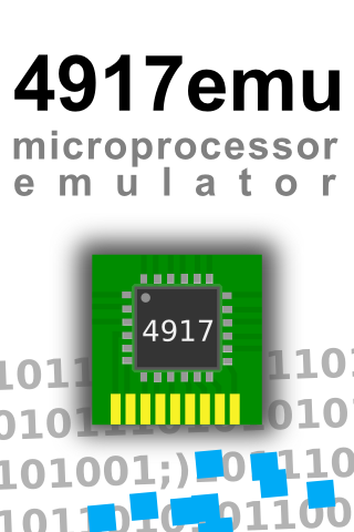
Let's take a look at the launch image for version 2.3. There is nothing special here. Just a title and a subtitle with an icon like picture. The whole thing put together on a pure white background.

So let's redesign it!
First, the app icon. I just used the existing one, without any change except not the have the version on a blue banner. I think it's a good idea not to have version numbers on your icon included.
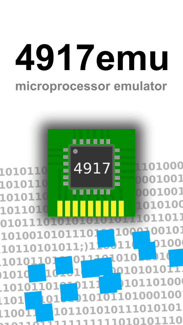
It has to be very real. This symbolizes a real micro processor an a PCB (Printed Circuit Board). Not the PCB Board has wires that connects the chip (black box with part number 4917 and pin 1 sign, little dot on the top left) with the pins on the board. There is also a view blank pins in gold as if you can plug-in the whole thing.
It has to be perfect. It feels natural as with real objects.

So let's look at the complete re-design. Note that the PCB board now seems to float on top. I also added a simple background with just zeros and ones with a little tilt. But there was something missing. It feels very gray at this state. So I just added a few blue little square boxes on the bottom and placed them randomly.
Is there a hidden message within the background? No. But wait, maybe you can find something else 😉
Note that I had to support three different sizes. One for Non-Retina, one for Retina 3.5" and one for Retina with a 4" display. Also note the difference in the layout. To support a small image you need to think bigger. It's sounds strange, but it is so. Because space is limited, you need to lay out thinks bigger.


Android
- Default Font does not allow to print greek letters - The default font on Android does not print the greek letters as UTF-8 correctly
- Some very basic JavaScript functions do not work out-of-the-box within Android. For example just to display a simple message box or to handle mailto links
Stores
Store Badges
![]()
(draft, new one for this site only)
![]()
(offical, but don't use that one!)
![]() (non offical)
(non offical)
Questions?
Just leave a comment below!


